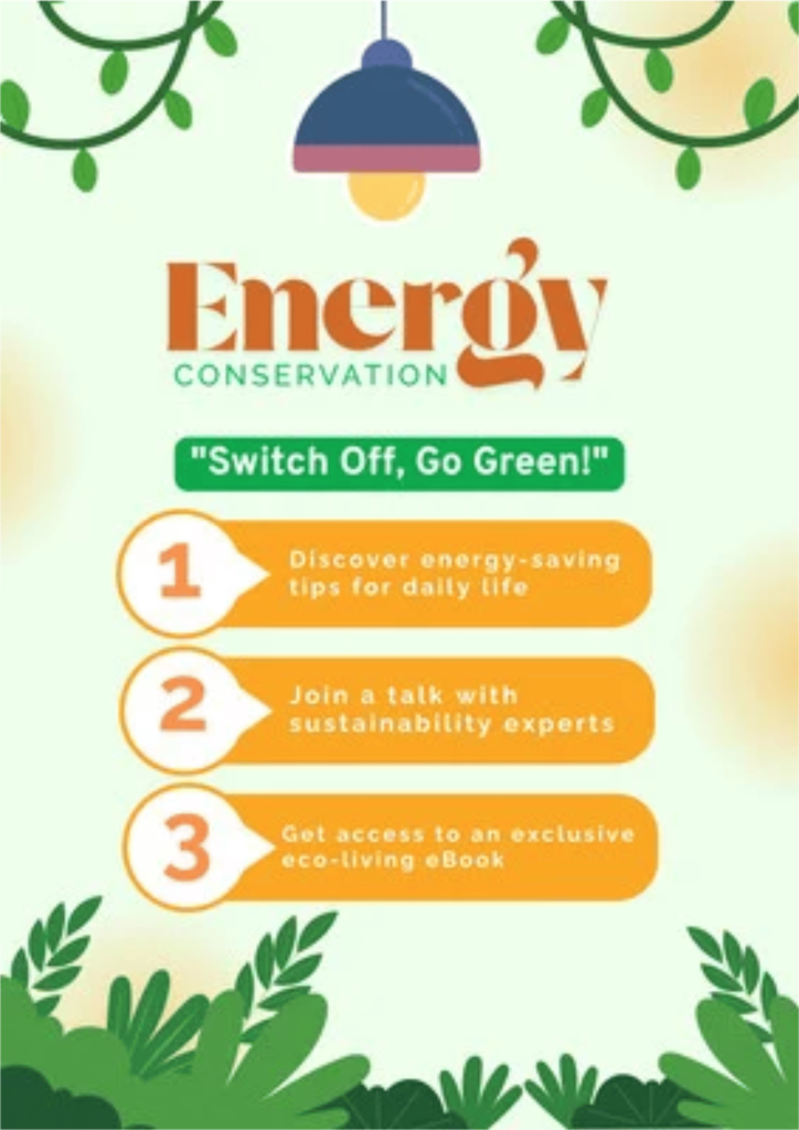
First, I made this poster by choosing a simple energy conservation theme with green, orange, and cream colors. I started by creating the main title, “Energy Conservation,” and then added the “Switch Off, Go Green!” slogan underneath it. After that, I made three orange sections with numbers and short information about saving energy. Finally, I added the lamp at the top and plants around the edges to make the poster feel more natural and connected to the environment.
It took me a few hours to finish the whole poster. Most of my time was spent arranging the text, choosing the right colors, and making sure each element was placed neatly. I also took some time to adjust the shapes and decorations so the poster would not look too crowded. After making a few changes, I was happy with the overall layout.
The final result is a simple and colorful poster that clearly shows the importance of saving energy. The green and orange colors help give it an environmental feeling, while the numbered sections make the information easy to follow. The lamp and plant decorations also make the poster more attractive. Overall, I think the poster successfully delivers the message of energy conservation in a simple and creative way.